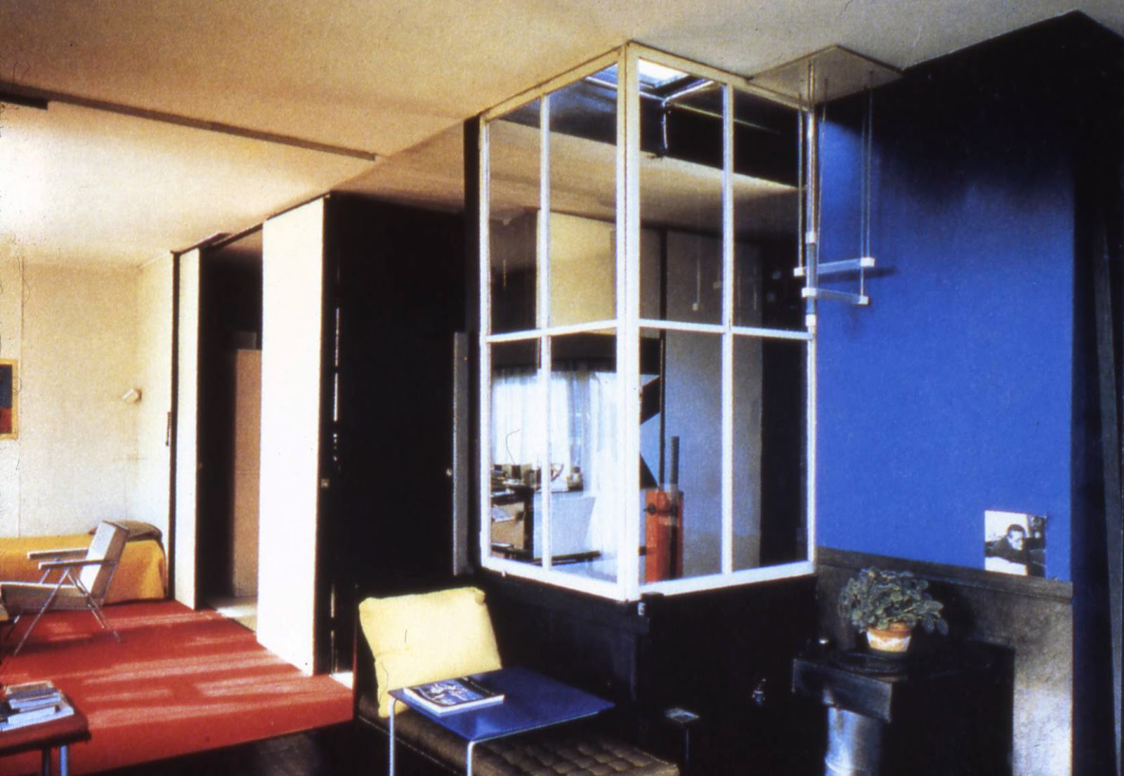
RED 5 has spent the day drawing, analyzing, and interpreting the Rietveld-Schroder house in plan and elevation. After countless sheets of trace paper and constant layering, we have come to realize many of the house's distinct design qualities.
PLAN LAYOUTS
These diagrams show that the building has a centralized core consisting of the spiral
staircase. This staircase runs connecting both levels of the building; all of
the other living areas have been planned around this central area of the house.
This diagram
shows the core area and general spatial organisation of the upper level. The
core area, being the set of circular stairs is shown as a black box from which
other areas on the floor can be accessed. Also, the upper level can be divided
into four main areas through which the three cantilevered balconies can be
accessed.
PROGRAMME
In contrast to
the upper level, the lower level proves to be rather conservative in design.
This conservatism is due to the fact that Rietveld and Schroder needed their
design to be approved by the building codes in Utrecht at the time. Coming in
through the entrance, there is a small hall which opens up to the central set
of stairs. Divided by the stairs there are six different spaces: a small WC, a
generous kitchen-dining-living area, a servant's bedroom, a small working
space, a studio (meant for Rietveld) and a reading room. The servant's room is
hidden at the back of the house and is only accessible by means of the
kitchen-living-dining areas and the working space. The reading room and studio
are easily accessible through the hall.

The upper level
of the Rietveld Schroder House has proven through analysis to be quite
multi-purpose and multi-experiential. The northeast side of the plan (bedroom
area and living/dining area) is relatively open and undifferentiated from the
exterior with clear access to the balcony and lots of glazing. The southeast
side of the plan is perhaps the most
intriguing: it's quite linear in character due to the roof which brackets the
space quite linearly. The linearity of the southeast side allows this part of
the building to merge seamlessly with the landscape (i.e. disappearing corner
windows). The openness of the southeast and northeast sections are in clear
contrast to the southwest side of plan which is shut off by opaque walls with
only a little patch of glazing that opens the building out to a single balcony.
The privacy of the bathroom is still maintained as the it has been fixed into
the wall.

With the
closing of the panels on the upper level, we see the creation of many new
spaces. Coming up off of the lower level, a hallway is created. This hall opens
up onto the small toilet, bath, a generously sized bedroom for the girls, an
equally generous boy's bedroom, and the living/dining area. Truus Schroder's
small bedroom is found hidden at the very back displaying Schroder's need for
privacy.
CIRCULATION

Circulation on the lower level is radial. Coming up from the entrance of the house, there is the main hall - through this hall there is access to the reading room, the studio, and the central stairs. Beyond the stairs, movement becomes circular from the kitchen-dining-living area to the servant's quarters which open onto the small working space. This working space further opens onto the studio. Each space on the lower level (with the exception of the WC) has access to the outdoors.
When all of the partitions on the upper level are opened, the circulation is still quite radial in nature but is circulation spaces are much wider. Some areas such as the hall disappear and the stairwell loses some of the shaft-like quality it gains when the partitions are closed.
When all of the partitions on the upper level are closed, the circulation (like the lower level) is radial except that circulation spaces are now tighter. In addition, spaces are created such as a small hall and the stairwell being transformed into a shaft-like structure.
ELEVATIONS
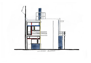


The elevations
are perhaps the best display of the visual independence of the components and
of the blurring between the interior and exterior of the Rietveld-Schroder House. This
independence has been highlighted by colour, placement and separation.
Components of the house are visually separated by colour, specifically: red,
blue, yellow, three different shades of grey, black and white. As these
different colours (and hues of these colours) have a characteristic of
optically advancing or receding (i.e. blue recedes and red advances), it helps
the building seem ever-changing. This is especially true in the different
lighting conditions that can occur on site. In addition, the colours help blur
the differences between interior and exterior. A perfect example of this is on
the southwest elevation where lintels of the building are painted black. As
windows during daytime appear black, making the lintels black optically removes
the appearance of the lintels being there. Therefore we have the sense that the
planes of glass meet the balcony and roof without interruption, and even
support it.
STRUCTURE & CONSTRUCTION
Rietveld chooses to use the traditional Dutch brick and wood construction in the Rietveld-Schroder House for several reasons. For starters, he's well aware of how brick with plaster overtop works with loads and duress - concrete at the time was a relatively new material and Rietveld was not particularly experienced with it. The biggest determining factor, however, was the cost. As the Dutch had been slipping into a recession for a while (1923 was a major lowpoint) the cost of making the entire building out of concrete would have been exorbitant and Rietveld was rather set against that. The only parts of the building that had been constructed out of concrete was the foundation and the horizontal and vertical balcony slabs. As the concrete balcony couldn't be supported solely by the brick wall, Rietveld added a horizontal "I" beam under the balcony slap that interlocks with a vertical stanchion for extra support.


.jpg)